
 well folks this is the final installment of the designtard series. and i would like to start off with an emphatic "DO FUCKING BETTER NEXT TIME JIM SAMPLES HEAD OF HGTV!!!" seriously, are you even a designer?? no...i get it..you are putting shows together based on what's reflective in the marketplace. well, let's show middle america that fake plants are not okay, lets show them that no one ever needs to do one stop shopping to decorate a room, instead lets show them how to reuse and recycle and refinish and buy well made products that last a long time and maybe that an ikea lamp here and there is okay so long as your whole fucking house isn't a page from an ikea catalog or pottery barn. let's show them that you don't need millions of dollars to redecorate (and i'm not talking about that design on a dime crap or FUCK ME joan steffand's droll kuntry klatch bullshit) and finally, let's show them that style CAN be learned by SHOWING THEM GOOD FUCKING STYLE AND TASTE!!!! and if you can't learn it you can fucking COPY IT!!!!!!
okay...on to the show... yep! dan failed. and quite honestly as you will see below he had the better design. but OBVIOUSLY (and again i'm talking to you HGTV) they had antonio's show planned from early on b/c the show he gets is not really decor based it's remodeling based BECAUSE THE GUY IS A FUCKING SET BUILDER! and yes, again...i GET IT hgtv...dan was a terrible on air personality. although he could have improved and most likely would have as it would seem his main problem was nerves and after a while those go away. but with antonio you have all of that already. he just can't seem to bring that into his sets..i mean rooms. and you can have your hgtv decor minions come in and "fix" his designs if need be. maybe you should hire me as said minion. i will show antonio how to make a room look less like a set and more like an inviting room. just sayin'.

 not terrible. still it's a little thoughtless in terms of panache and detail. but i don't HATE it. he went a little mirror crazy. but the mirrors he put over the fireplace are pretty cool considering they are really a cabinet with sliding doors hiding a flat screen. in the immortal words of will farrell doing james lipton...well plaaaaayed!

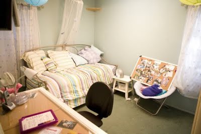
 over all the best room in the bunch in either house. the bed is great. it's a great blend of style and function and he put a vintage looking loveseat in there! good job dan. it gets a b- from me because i would have liked to have seen another color in there instead of all that mauve and lilac. maybe a bright, yellow velvet..something...to give it a little punch.
 again...meh...the floors are travertine (gross) but here they worked. the backsplash is all wrong. too yellow. it will look dated in no time. should have gone tiny, classic subway tiles or stuck with the bamboo tiles in a different color.
here is the master bedroom before:
and after: words cannot describe my loathe for this room. it's a very small room and all the bullshit dark wood is making the room appear smaller. and those blue and brown pillows make me want to kill someone. oh look!! the rug matches too!!! i just threw up on myself. it's just all so matchy matchy, uninspired and CHEAP looking. if you're gonna do built ins in a small space at least do them all white or paint them all the same color as your lavender walls. that way they would disappear making the room seem bigger. and really with the white shutters? if you were going to keep them then that would have been my starting point for the WHITE built ins so that i could achieve a more cohesive look.

 yep fangtonio won. maybe if he used some of that chiang mai dragon fabric (or similar looking knock off) i could have looked past everything else that sucked. ok no i couldn't but still, that apron is WORKING ME!!!
here is the before kitchen: here is the after:
 whatever...yawn...she (the client) asked for dark counter tops and light cabinets saying she liked contrast. while the counters and cabinets DO contrast it's just. so. fucking. boring. if it were me i would have done something like this:
 and added elements of this:

and after:
 first of all what in the fug are those hershey bars over the bed suppose to mean? art? more like fart. for me this is more of that zen bullshit he keeps throwing on us. i mean there are elements in here that could work...like the bedding is not bad...but what the french is up with those fluorescent light boxes on the ceiling? really? couldn't change those? think we wouldn't notice?
 or this:
 yeah, yeah...i know antonio, i know. those rooms are not your aesthetic...so if you're gonna (gag) do zen(gag)modern then do something like this:
 light, airy, neutral, live things...nothing jarring...
 texture, texture, texture...and some major lighting wow factor.
  only with a bit of glamour, elegance (things a bedroom should have and the wow factor hgtv so desperately loves) AND it looks inviting.
here's the after:
 yes, fangtonio gave mom a fucking ottoman to sit on while her son plays. good one fang. that looks really fucking comfortable.
 and last but certainly least was the room the judges flipped over (tandice and psycho eyes were about to go all axe commercial on him). here is the before:

here is the after:
 pretty sure he was going for a modern eclectic look. this room is oookaaaay. it's just not good enough. the orange chairs are good. the big hutch over the fireplace that he hacked to make into a storage unit for the tv is a GREAT idea and it's a beautiful piece. the detail up close was really pretty, lots of colors. but i just think it would have stood out more if he toned the room down a notch. there's just too much going on. i would have done a lighter bamboo roman blind and then had the curtains match the wall color a bit more so the eye moved around the room more easily. those green curtains just make my eyes stop every few feet. and the pendant light, while cool, is all wrong for this room. something shiny and sparkly but still modern looking would have worked better.
  see, there is lots going on in the room but the background is neutral and soft so that the business of the patterns and colors doesn't feel overwhelming.
 alright look...the thing of it is i KNOW this type of shit isn't easy to do for a television show and i am pretty sure both of these guys have some talent and will improve over time, so no hard feelings boys- i would make out with both of you, but come on hgtv!!! let's do better next time..whatever that means. if that means more time for these people then GIVE IT TO THEM! if it means better (and more) resources then PROVIDE IT! if it means putting me on your show THEN DO IT!! i am not trained and could probably only build a box out of popsicle sticks but if i had good resources and time i think i could put together a whole house and make it look outstanding.