trendz you hate part 2..

let me first say thank you for contributing to this little science experiment.  and for (the majority of you) taking it lightly. 

this isn't meant to crush dreams.

love what you love and the rest of us can fuck off..

and i think now is a good time perhaps to address some of my newer readers..

hi!

i cuss a lot.

if you don't like it, fuck off.

this isn't sunday school.

this is my house and you all are my guests.

and no, my cussing isn't a trend.  if that's possible.

i really do cuss.

everyday.

see "MFAMB you say fuck a lot"..

i also talk about poop and farting, frequently.

i don't sugar coat things.  i tell it like it is.

and when i am wrong about something i try to make it right.

see here.

so..

welcome to my favorite and my best.


let's get started...


white kitchens and white subway tile:


ok.  this isn't a trend. this shit is classic.

i mean what are your options?

cherry? barf.

my feeling is that white is never a trend.  

so long as you keep the lines modern in a white kitchen it will always be timeless.

and subway tile is waaaaaay better than most of the other options i have seen.

i think this "classic" is a great canvas for you to work the real trendz into and then be done with them when

they show up on this blog everywhere. 


slipcovers:

this isn't a trend!

this is a fucking necessity of life!!!

if you have kids or pets

then these are a lifesaver..

(double offender- slipcovers IN a white kitchen)


there are rules though!

1.  they must be tailored to the specific piece of furniture they are covering.  

none of this shit:

2. they must be goodlooking.  see above.

3. loosefit slipcovers are best left to the european chateaux/countryhouses where nothing ever looks bad.


lanterns:

i am on the fence here.

sometimes, like the above photo, people just use them all wrong!!

but in general i think they can be really cool.


greek key:


still rocks my box.

in small doses though people.


hermes boxes as decor:


yeah.  sometimes i think...ooooh look how pretty that orange looks in that spot!! (see above)

and then i go...but could we get any more pretentious here?? (see above above)


belgian style/industrial cart coffee tables:

i'm gonna have to agree on the cart tables...

they have become synonymous with belgian style , plus they're at pottery barn!!!

but belgian style itself has evolved slightly..

i'll take the modern, sparse approach to belgian style:

chances are if you're a neutral girl/gay you still love this look when done well.


plates on the wall:

gonna have to agree.

i'm over these.

as i raise my hand in offense.

yep.

mfamb has plates on the wall, plates on the wall...lookin like a fool with her plates on the wall..

trying to find replacement art as we speak.

i can assure you it won't be anything like this:


this:


this:


or this:
o to the motherfucking ver.

(don't take it personally.  i don't give a fuck what you hang on your walls!)


eames shell chair:

i know it's a classic but i'm sick of looking at it too.

every hip, skona hem flea market chic loving blog features them

it's become a signature chair to own if you love this style.

it's like the one splurge item in a house where everything else is from ikea.


fabric covered rocks:

i can't believe i wasted 5 minutes finding examples of this bullshit.

you'd better be glad they're covered in fabric when i throw them at your face for ever making, buying or featuring them on your blog/magazine with the words swoon or j'adore attached.


taxidermy:


this is a trend if ever there was a trend.

this whole look is so affected i can't even look at it without wanting to sword myself.

unless you are old and crazy with your taxidermy pet there is really no excuse for this poser behavior.


seashells:

ya know, i don't mind them here and there..

and i know the rule of thumb is only in a house near the beach..

but even then it can suck if they are everywhere.

if you have a collection of them display them like a. wentworth above.

the rest of the decor in that room is based around that seashell collection above..


this, however, is a no:

(triple offender, burlap, shells and slipcovers!)


candles in the fireplace:

in the case above i think it looks kinda pretty.

in the case below i think it sucks ass:

but i am pretty sure this is due to the fact the everything about the second picture is ugly.

specifically one of my personal not favorites- sticks in a vase.

sticks in a vase, sticks in a vase...lookin' like a fool with yer sticks in a vase.


your hate in a nutshell- part 1

well first of all only like 4 of you posted links to pics of your disgust.

 so i had to do more work.  fart on all of you for that.

secondly a few of you talked about how lots of design bloggers are mormon.

i did a pie chart for you:

i don't know what this has to do with design trends that you hate but ok.

i did think it was kind of a weird phenomenon.

i don't even know what a mormon is except mormon dudes do it with a lot of women at one time.

so good for them.

anyway..

most of you hate the same shit as me.

and maybe hate is a strong word.

maybe what we really mean is we are just sick of looking at certain things.

after reading all of your comments yesterday (160 and counting!!!)

i started to feel kinda sorta bad.

i mean, we really and truly look at design and decor related stuff all day long.  so we see everything.

a lot.

everywhere.

two comments from yesterday put into words what i was feeling:


"I think most things can be done well or poorly -- it's all about context and style. The problem is that decor blogs allow content to be recycled and disseminated so quickly that everyone can have the same stuff, the same "look," at the same time. As a result, most rooms that appear online lack substance and they lack heart. But they make pretty pictures. I was commenting to Raina the other day that I'm sick to death of everything I see online. The only solution is to change the direction of the discussion, and to be honest about the spaces we really want to live with." 

erin @ design crisis


and..

"I also disagree with our desire to be constantly entertained/ inspired by something new -- that thinking actually leads to the disposable, trendy cycle you claim to hate. You can't hate the beast and expect to be fed by it.

If you're uninspired, go outside. Go to a museum. Read a book. Quit tapping the same well. Myself included."

shauna cross


in short..we are fucking ourselves.

so what do we do?

stop reading blogs?

can't do that.

stop being so judgemental? 

we can try i guess.

take up a new hobby?

maybe.


in any case i think we have to separate the classics from the one hit wonder trends..

like those FUCKING BUS STATION SIGNS!!!

so lets do that:

keep calm and fuck off...

i didn't include this one in my original post bc i figured it was a no brainer.

plenty of vitriol surrounding this one.

i think worse though are the knock offs like that little green one bottom right: 

"get excited and make things".

hang this, hang yourself.

if it's the color of the poster that you seek go get some paint and paint a canvas and then hang that.

original.


shabby chic:

elements of the shabby chic style are a classic to me but when you throw it all together in one room and the whole thing is just so overly feminine i just think it sucks butthole.

a little more modern with cleaner lines and some masculine touches keep the look fresh and pretty:


 poufs:

i still love a pouf.

i can't find anything bad about them.

maybe i don't see them everywhere and that's why.

i see them a lot, don't get me wrong. 

but they are functional and add texture and visual interest to a room.

i tend to like them in neutral colors more than orange, purple or pink.

i group poufs with these:

i am slightly on the fence about them.

i think they are a classic but maybe we need to give them a rest for a while or stop with the cheap knockoffs in trendy finishes and find a cool, unique vintage one on ebay or something:


big ass clocks:

i'm gonna have to agree here.

these are like the bus signs to me.

graphic for graphic's sake.

not original.


you also talked of phrases you hate hearing on every single blog.

i mentioned the word "rad".

here are some you mentioned:

"pops of color"

"swoon"

"lurve".

ok, i wouldn't be me if i didn't offer up some alternatives.

so how about,

"crayola moments"

"fuckness!"

and

"fart-tastic"


go ahead, use them!!


crafty chic:

i guess the idea of diy crafts is that you don't want them to look diy.


mirrors leaning against the wall:

i got no problems with this.

you try hanging that big fucking thing.


foo dogs:

yeah. no.


tiffany lamps:

were these ever good?

they belong in this type of decor:

arts and crafts.

or as i like to call it,

 decorating out of your ass.


cluttered coffee tables:

i agree to a degree.

mine is covered with books but it's huge and there is still plenty of room for drinks and feet propping.

we used to eat meals at ours too but now that we have a kid meals are eaten at the dining room table.

only on special occasions or pizza nights do we eat around the coffee table and books are easy to move.

but there is a fine line between good clutter and bad clutter.

the above examples are walking that line.


chevron:

to me this is like suzani or ikat.


a classic that needs to be presented in small doses.

the black and white chevron is a little overdone.

but it's so graphic and eye pleasing.

i might be alone here but i think the diy chevrons are actually better than the mass produced ones from say west elm or the other buttstores.

they seem unique and cool.


moss balls:

ahhh-greeed!


the domino look:

i wanted to agree with you here.

and i tried.

but i went through some domino images and i couldn't find anything i completely disliked.

except maybe the antlers in the top photo.

but the rest is still rully rully good looking.


maybe this one:

change the wallpaper and the clusterfuck art and i love it still!!


chalkboard paint:

agreed. 

this is tired.

and dusty.


restoration hardware:

all that beige blandness is whack.

why do they do this?

why can't they style it with other shit that isn't brown?


hipster weddings:


while i think i enjoy the naked wedding picture the others seem a little too trendy.

but i think, unfortunately, i am a hipster.

so...

what?


antlers:

agreed.

and while were at it..

big, fucking letters as decoration.


 burlap as viable fabric choice:

we have quadruple offenders present here:

burlap with WORDS!!

sisal.

hide.

hide ON TOP OF sisal.

orchid.

i'm gonna have to concur.

burlap is so ballard 2003.


flatscreens over the fireplace:

look.

next to my husband my tv is my best friend.

that shit is a fact.

i would argue that most people put their flatscreen over their fireplace bc there is no other option.

i mean where the fuck else are you gonna put that giant, wall-raping square?

that said, if you have options the fireplace should be the last option.

but it's way better than this dumbass choice:

that shit is just dangerous and stoopid.


chiang mai dragon and imperial trellis:

i don't hate either one.

but maybe lets just stop talking about it.


same with this one.

gray:


i love gray.

it's such a great neutral.

it will never really be "out" entirely.

i just think we need to begin to use it a little more unexpectedly.

i think the key to everyone loving gray walls again is to pick the right gray.

easier said than done.

and i do agree, it is everywhere.


the cheap looking designer lines for target:


i have to agree on this one.

i was less than impressed with these two.


wellies/boots under a table:

i really don't have a problem with this so long as it is cold outside or rainy, they are by the door, and you actually wear them.

if you are propping your boots up as decor than you are an asshat.


white parsons desk + ghost chair:

there's a fucking maelstrom of parson/ghost combos out there.

notice all the offenders present:

poufs.

inspiration boards.

hides...


design sponge-y ugly piece of furniture makeovers:

i guess the bottom line is an ugly piece of furniture is an ugly piece of furniture.

agreed.


books arranged by color:

soooooo done with this.


zebras and cows:


love. them.

believe they are the least of our decor worries.

in fact i suggest you learn to love them.

i have one and they are soft and they take a ton of abuse well.


adler style:

i personally have never had an adler moment.

not a fan of the happy, preppy chic.

but i don't think it's overdone.


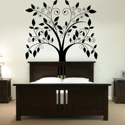
wall decals:

massive hate.


cole and son's woods wallpaper:

i still think it's cool but i agree that it's EVERYWHERE!!


can we at least stop using it to create a theme room?...


and for shitsake no antlers on it... 


ok folks...

that's a lot of posting..

so i am going to continue this scientific experiment tomorrow.


i hope you see that this is all in good fun.

observations are ok, and discussions are encouraged.

but let's try to be respectful.


what have we learned so far?