design turd episode 5: the final nural

nina goes home.

we saw this coming though didn't we?

you can't make snail trails and paint pink boxes meant to be "conceptualized" as orchids and expect to go far in a design competition right?

she offered up zero design.

unless you consider painting projects, design.

i don't.

i consider them painting projects.

so good fucking riddance then, right?

and we are watching this show for the design element, right?

not bc we want her around for the drama she creates..or should i say the producers are creating..

not me.

i want a bunch of fucking talented folks to take spaces and transform them into something interesting and/or beautiful.

with furniture and fabric, paint and architectural accents, accessories and lighting.

i want to see talented, creative people use their skills to make a shell of a room into something amazing.

that's all.

i see bloggers do it all the time.

FUCK YOU FUCKING HGTV!


so i will attempt to BLOG. THIS. DREARY. FUCKING. BULLLLLLLSHIIIITTTT!!!!!!!

here's your winning design "element"....

casey painted a fireman.

which i actually like as an art piece in a firestation.

but overall the wining space sucked my butthole just as much as the losing space..

FUCKING LOOK AT IT GODDDAMN IT!!!!!! :

that sky line mural is alex's.

WHAT GODFORSAKEN DESIGN SCHOOL IS TEACHING PEOPLE THAT MURALS ARE AWESOME???

BURN THAT PLACE DOWN IMMEDIATELY!

oh, should i have backed up and told you what this challenge was about?

ok...sorry.

2 teams:

red team:

tom, nina, courtland, stacey and your mom

blue team:

emily, michael, casey, alex and your dick

give 2 fire station's a room to decompress and chill in.

that should also serve as a place for powerpoint presentation or something.


i can tell you next what happens is these turds fucking start building shit out of cheap supplies and it's all fucking sad clown bullshit.

emily builds a table (again, this is the winning room).

she also tells us that she doesn't build tables she buys them and that she is worried that this is going to look like a kindergarten art project...

guess what emily..

IT LOOKS LIKE A KINDERGARTEN ART PROJECT!!!!

DID SOMEONE HAVE A GUN TO YOUR HEAD AND TELL YOU TO MAKE A FUCKING STUPID, CONTRIVED TABLE???

IF I WERE ONE OF THOSE JUDGES I WOULD HAVE RIPPED THAT SHIT OFF THE FLOOR AND TOSSED IT INTO THE GODDAMN FIRE SIMULATOR!!!!!!!

and now on to the losing room..

what you are about to see made vern go from mad...

to crazy mad gaysian...

here it is...

the losing space:

stacey carved out a number 5 and spray painted a piece of mdf gold and mounted it.

this friends was the judges favorite part!!!

the FUCKING NUMBER 5!!!?????

on a FUCKING PLAQUE!!???????!!!!!!

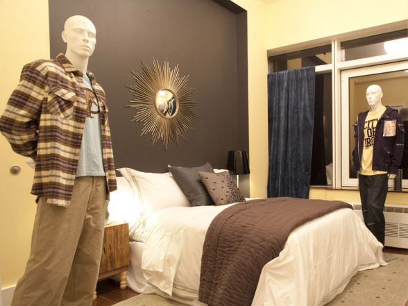
also nina was responsible for the fucking repellent furniture and the braile nural...

which she said was a functioning corkboard and also some shit about hidden messages and the fireman's motto or creed or SOME SUCH FUCKING CRAZY CLAPTRAP!

and courtland who is probably the biggest douche on this entire show..

gave us a 70's porn rape basement..

do any of these fucking blockheads have any style?

would miles redd make a fucking braille corkboard in a firestation lounge?

what would the novogratz's do?

remember what they did with the men's gym?

yeah, it's fucking awesome.

i probably wouldn't do the lavender wallpaper for burly firefighters but that is not even remotely a problem that couldn't be addressed.

i fucking hate this show.

now..

onto some shit that's been on my mind...


i started recapping these turd shows last season.

to my knowledge i was the only blogger doing so.

at least in the tell-it-like-it-is-with-red-scribble-and-drawings that i became known for.

i enjoyed doing it.

it was my thing.


now there are so many blogs out there recapping this shit pageant.

very similar to mine.

which leaves me feeling a little dry and uninspired.

     i kind of feel like what's the point?

i don't get excited about recapping this show anymore.

and i don't want to be one in a list of bloggers who blog about the same show.

it makes me feel all gross inside.

afterall what would desire to inspire do if MFAMB started doing "monday's pets on furniture"?

only i changed it to "tuesday's pets on furniture"..

wouldn't that be kind of weird?

i'm not saying i own all rights to design star recaps.

i certainly don't.

but i also don't want to be a clone.

thoughts?


design turd episode 4: mandice not rocking mancoats. oh, and another terrible idea for a challenge.

dear mandice,

i can't be sure how tall you are but i am guessing 8 ft?

those coats aren't doing you any favors.

plus, when have you ever seen one of these long coats on anyone other than morpheus from the matrix?

i would prefer to see you in a coat that hits mid bottom.  this would cut you off in just the right spot so as to not super elongate your already giraffe type proportions.

otherwise you look like a caterpillar emerging from it's pupa.

also what's up with vern's madonna bracelet?

speaking of vern and mancoats:

this was the challenge opener.

"you so funny vern".

see what happened was mandice told the turds that they needed to design a space around a flower.

each turd picked a flower and then vern shows up with all flowers made into a bullshit bouquet.

which is precisely why this shit was doomed before it even started.

as in give each turd a room to turn into something beautiful inspired by their flower.

right??!

wrong!!!!

now that all of you have picked your flowers we are going to mix them up into this ugly ass bouquet in a mandiced proportioned cylindrical vase and then you get a corner of a room to show how your flower works with all the other flowers while still showing your individuality and making this room pretty..

record screeching....

eh? come again?

is hgtv 'avin a laff?

here are the list of the turd's flowers:

nina- orchid

casey- hyacinth

emily- wax flower

stacey- carnation

alex- snapdragon

dan- daffodil

courtland-  lily

tom- tulip

michael- ranunculus


surprisingly the rooms seemed as cohesive as they could have been and there were a few pretty designer-y moments.

this is pretty much what both teams started off with..

nina started off talking about the powers of faux wainscoting and "nurals" as per usual..

neens,

murals are not cool. and unless you are michaelangelo they are never good.

anyway, she produced said spawn. and i added a mural of my own for aide purposes.

she also gave us this:

a sexy backless shirt and nude brawr. 

i didn't think this was the type of shirt you could wear a brawr with.

therefore if you can't NOT wear a brawr you can't wear a shirt that would require you to go brawrless.

i for one would knock someone out if i went brawrless. i have seen your tits neens and they are massive as well.  probably best to leave this blouse to the boobless.

overall the women + dan's room was my favorite.

i really enjoyed the faux wainscoting actually AND the tonal variation with the blue.

although i think there is a lot of busyness here that i would have toned down..the hits of hot pink, the brown rug, the pillows...i don't know..

take away the pink square on the wall and the hot pink ottoman..replace it with something a little beaten up or worn... or....burn that shit velveteen rabbit style and do something like this instead:

or this:

and the swing is gimmicky and stupid.

overall its too lady pretty.


unfortunately for dan...


his cluster of daffodil inspired picture frames hung like turds, wasn't enough...


over on the men's team we have minimal, airy and boring..


somwhere in here is courtland's lily...


unfortunately alex said that the snapdragons reminded him of asparagus..

maybe?


but sadly his snapdragon/asparagus art installation wasn't snapdragon-y or asparagus-y enough..

i'll tell you what DOES look like asparagus:

so with alex and dan in the bottom two who's host reel would suck the hardest?

that unfortunate honor went to dan.

so sad dan.

you shouldn't have become your team's handy man and focused more on your wall of turds.

nobody won either by the way.

there were just a top 4 and a bottom 4.

no idea who the top 4 were.

but nina, courtland, alex and dan were the bottom 4.

and i guess that's all that really matters.

dan, if you want there are a few "jobs" over here you could hammer out for me...

word turd.


design turd episode 2: what the fuck IS this bullshit?

watching this show makes me feel and say things like this:


this week the turds had to design an apartment based on a bunch of terrible looking clothes.

they had to work in teams.

men vs. women.

let me start off by saying this...

when i decorate a room i certainly don't do it based on an outfit.

and never one a gay lumber jack would wear,

or some yoga pants.

who is coming up with this bullshit?

that said...i think if i did get the gay lumber jack outfit i might try to do something like this:

not this:

these are casey's and tera's "designs".

casey got the gay lumberjack and tera got the thug wear? teenager clothes? meth addict?

what the FUCK IS THIS SHIT??!?!?!

as i sit down to write this i am ever so confused, much like mugatu in the clip.

first of all it is hard to judge the designs when in the photos you can't really tell what the fuck is going on or who did what. 

let's just start from the beginning..

ok so the turds line up in front of a runway.

genevieve tells them, doing her best corpse impersonation, that they are to design a whole apartment base...wait a minute i already told you this....see?

crazy pills.

but the best part is that the winning turd will be featured in REDBOOK magazine!!!!


REDBOOK!!!

does anyone read redbook?

besides my grandma?

nina seemed to think that that was a huge career maker. a "dream" even.

after each turd picks their "outfit" they're off to start planning the space.

nina takes the lead starts telling everyone what to do.

no one likes it but nothing is said in protest.

as in "fuck you nina you're not the boss of me!!"

that's what i would have said.

nina.

does anyone feel like they have seen her somewhere before?

hmmm...

let me think...she just looks like someone and..i...can't...put...my...fingeronit.....

!!!!!!!!!! i got it !!!!!!!!!!

glad that's out of the way..


so alex picks a wedding dress and proceeds to give us a straightjacket:

for good measure and bc pajamas=bedroom lets park dan's pajama inspiration mannequin next to the bed cell and paint the walls pink and style them (scarcely) with a bunch of useless knick knacks.

and who doesn't love a rumpled throw on the end of a bed?

it's just so real life!!!!!!!!!!!!!!!


bloggeremily picked a pink suit and gave us this:

cute. i love the pig. and all the shiny brass and gold elements.

although in the show it was nina who picked the pink rug not emily.

and it is killing me that there isn't a red something in this room.


and here we have a perfect example of why this challenge is so fucking stupid...

notice all 3 mannequins..

michael's leopard outfit, courtland's business separates(?whatwouldyoucallthat?) and trentkenneth's tommy bahama tool outfit.

never in a million years in real life or fake life would you have those 3 inspirations working together in the same room. it's just fucking fartknocking bullroar is what it is.

now mind you courtland won with his striped wall inspired by those...black...separates?..froooom...19..eightyyyy...four?

and if i weren't so confused and dumbfounded by this whole shitfest i would be downright outraged..

do you wanna know who i think should have won???

this one:

yeah. i do.

here's why.

tom took the stupidest of stupid all time gayest outfit to inspire a room and created a nook that looks..

(mind you with better lighting and a rug)

 like a perfect interpretation of that heinous sportswear!!!

just not getting the umbrella stand on the windowsill.

punches for that tom.

mismatched iconic chairs=good.


back to the losing team...

the girls.

stacey took the whole day to paint a chair.

terribly i might add.

that is the shittiest paint job on furniture ever in the history of forever.

1. it took her all day.

and

2. it is the saddest, dullest worst ever color and finish.

it's obvious she used leftover paint from somewhere and she took a GORGEOUS chair and made it look like it has fucking smoker's lung.

not only that but this little scenario has NOTHING to do with that cute lily pulitzer dress.


and then there's nina's bug mural

based on that gorgeous beaded dress!!

"CO-CHURE" mandice called it.

ahhhh....bohemian chic...

when i think of bohemian chic i think of this woman...

what would iris apfel have done you numbskull???

i damn sure know she wouldn't have attempted to eek out a gold bug on a black wall after looking at that dress.

if it were me...

i would have gone for gorgeous fabrics and a Moroccan vibe done in a casual way.


ok.

so the bottom two this week were

mickey rourke and tera for painting her room this fucking abysmal shade of yellow.

ultimately tera went home.

sorry tera. i know you stood by your yellow wall. stating to us all that "it's ok to paint a room yellow". and you're right it is. but not the nasty yellow of that tshirt your meth head mannequin is wearing.

it's sickening.

especially in the glare of fluorescent lighting.

i'd like to know what person looks at that color and says, MAN that's a pretty yellow!!!

i would dare say 2 people in the whole entire world tera.

T W O

one of those people being my 5 year old bc i say it sucks and she like to be the opposite of me.

plus i think you were supposed to be inspired by the outift and perhaps the PERSON WHO WEARS the outfit.

the person wearing that outfit probably decided if they were gonna rock their air jordans with their loony tunes applique jeans or their rocca wear jeans while cruising the local mall trying on cologne and looking at 12 year old girls.  it's a lose lose situation tera.

vern wasn't buying it either tera.

vern is a little bitch isn't he?

i love it though.

at least he's not embarrassed to be there like genevieve is.


at the end of the day this show is a fucking joke.

these are not feasible design challenges.

no one would take 6 outfits and mesh them together to make one apartment.

just like no one would furnish an entire room from pearl river.

so in that respect you have to cut these turds some slack.

SOME slack.

on the flip side of that is that the producers/judges are trying to see who can take the shittiest of situations and create something that is liveable, tasteful and modern.

i think this show will get better as the numbers wear away.


lets hear it..