design turd episode 2: what the fuck IS this bullshit?

watching this show makes me feel and say things like this:


this week the turds had to design an apartment based on a bunch of terrible looking clothes.

they had to work in teams.

men vs. women.

let me start off by saying this...

when i decorate a room i certainly don't do it based on an outfit.

and never one a gay lumber jack would wear,

or some yoga pants.

who is coming up with this bullshit?

that said...i think if i did get the gay lumber jack outfit i might try to do something like this:

not this:

these are casey's and tera's "designs".

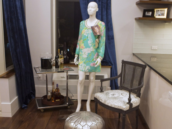
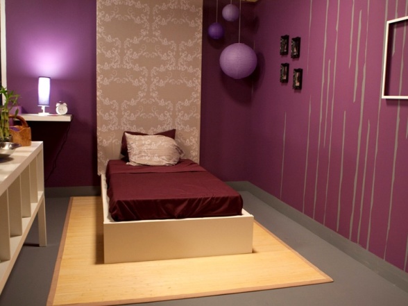
casey got the gay lumberjack and tera got the thug wear? teenager clothes? meth addict?

what the FUCK IS THIS SHIT??!?!?!

as i sit down to write this i am ever so confused, much like mugatu in the clip.

first of all it is hard to judge the designs when in the photos you can't really tell what the fuck is going on or who did what. 

let's just start from the beginning..

ok so the turds line up in front of a runway.

genevieve tells them, doing her best corpse impersonation, that they are to design a whole apartment base...wait a minute i already told you this....see?

crazy pills.

but the best part is that the winning turd will be featured in REDBOOK magazine!!!!


REDBOOK!!!

does anyone read redbook?

besides my grandma?

nina seemed to think that that was a huge career maker. a "dream" even.

after each turd picks their "outfit" they're off to start planning the space.

nina takes the lead starts telling everyone what to do.

no one likes it but nothing is said in protest.

as in "fuck you nina you're not the boss of me!!"

that's what i would have said.

nina.

does anyone feel like they have seen her somewhere before?

hmmm...

let me think...she just looks like someone and..i...can't...put...my...fingeronit.....

!!!!!!!!!! i got it !!!!!!!!!!

glad that's out of the way..


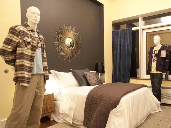
so alex picks a wedding dress and proceeds to give us a straightjacket:

for good measure and bc pajamas=bedroom lets park dan's pajama inspiration mannequin next to the bed cell and paint the walls pink and style them (scarcely) with a bunch of useless knick knacks.

and who doesn't love a rumpled throw on the end of a bed?

it's just so real life!!!!!!!!!!!!!!!


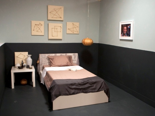
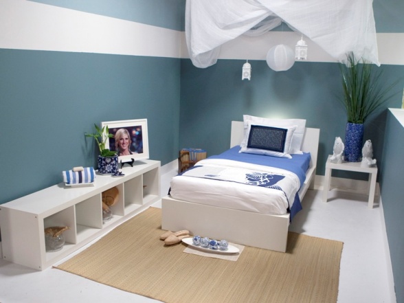
bloggeremily picked a pink suit and gave us this:

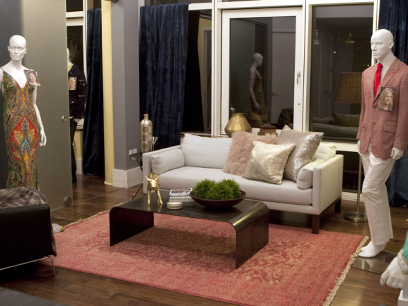
cute. i love the pig. and all the shiny brass and gold elements.

although in the show it was nina who picked the pink rug not emily.

and it is killing me that there isn't a red something in this room.


and here we have a perfect example of why this challenge is so fucking stupid...

notice all 3 mannequins..

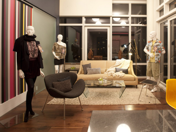
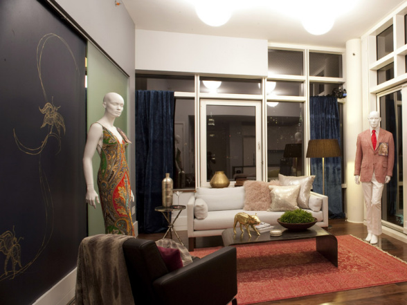
michael's leopard outfit, courtland's business separates(?whatwouldyoucallthat?) and trentkenneth's tommy bahama tool outfit.

never in a million years in real life or fake life would you have those 3 inspirations working together in the same room. it's just fucking fartknocking bullroar is what it is.

now mind you courtland won with his striped wall inspired by those...black...separates?..froooom...19..eightyyyy...four?

and if i weren't so confused and dumbfounded by this whole shitfest i would be downright outraged..

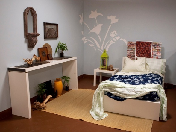
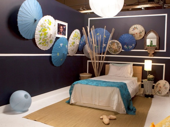
do you wanna know who i think should have won???

this one:

yeah. i do.

here's why.

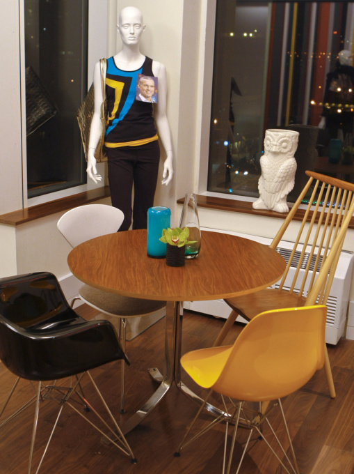
tom took the stupidest of stupid all time gayest outfit to inspire a room and created a nook that looks..

(mind you with better lighting and a rug)

 like a perfect interpretation of that heinous sportswear!!!

just not getting the umbrella stand on the windowsill.

punches for that tom.

mismatched iconic chairs=good.


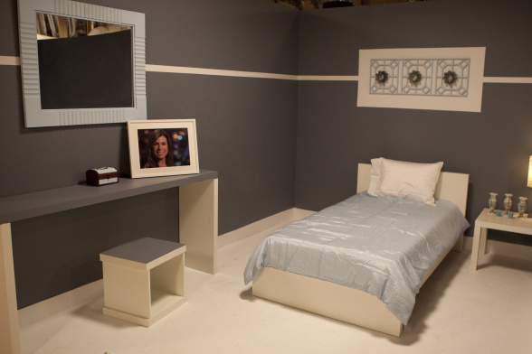
back to the losing team...

the girls.

stacey took the whole day to paint a chair.

terribly i might add.

that is the shittiest paint job on furniture ever in the history of forever.

1. it took her all day.

and

2. it is the saddest, dullest worst ever color and finish.

it's obvious she used leftover paint from somewhere and she took a GORGEOUS chair and made it look like it has fucking smoker's lung.

not only that but this little scenario has NOTHING to do with that cute lily pulitzer dress.


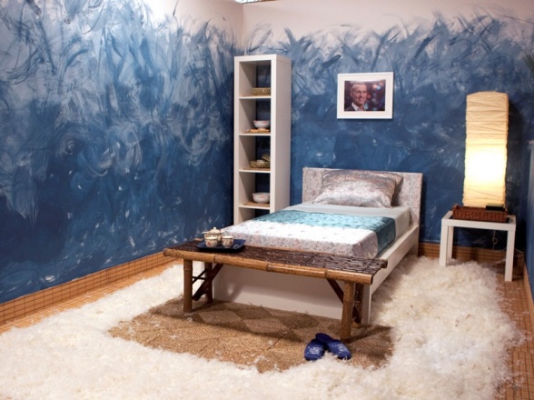
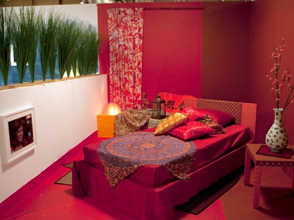
and then there's nina's bug mural

based on that gorgeous beaded dress!!

"CO-CHURE" mandice called it.

ahhhh....bohemian chic...

when i think of bohemian chic i think of this woman...

what would iris apfel have done you numbskull???

i damn sure know she wouldn't have attempted to eek out a gold bug on a black wall after looking at that dress.

if it were me...

i would have gone for gorgeous fabrics and a Moroccan vibe done in a casual way.


ok.

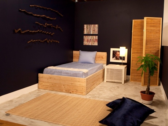
so the bottom two this week were

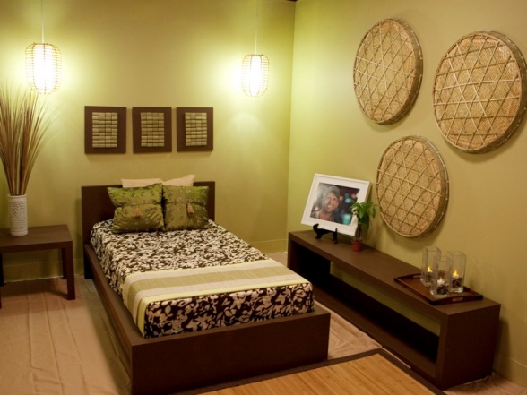
mickey rourke and tera for painting her room this fucking abysmal shade of yellow.

ultimately tera went home.

sorry tera. i know you stood by your yellow wall. stating to us all that "it's ok to paint a room yellow". and you're right it is. but not the nasty yellow of that tshirt your meth head mannequin is wearing.

it's sickening.

especially in the glare of fluorescent lighting.

i'd like to know what person looks at that color and says, MAN that's a pretty yellow!!!

i would dare say 2 people in the whole entire world tera.

T W O

one of those people being my 5 year old bc i say it sucks and she like to be the opposite of me.

plus i think you were supposed to be inspired by the outift and perhaps the PERSON WHO WEARS the outfit.

the person wearing that outfit probably decided if they were gonna rock their air jordans with their loony tunes applique jeans or their rocca wear jeans while cruising the local mall trying on cologne and looking at 12 year old girls.  it's a lose lose situation tera.

vern wasn't buying it either tera.

vern is a little bitch isn't he?

i love it though.

at least he's not embarrassed to be there like genevieve is.


at the end of the day this show is a fucking joke.

these are not feasible design challenges.

no one would take 6 outfits and mesh them together to make one apartment.

just like no one would furnish an entire room from pearl river.

so in that respect you have to cut these turds some slack.

SOME slack.

on the flip side of that is that the producers/judges are trying to see who can take the shittiest of situations and create something that is liveable, tasteful and modern.

i think this show will get better as the numbers wear away.


lets hear it..

design turd episode 1: picking the shiniest turd out of a bunch of giant turds (***updates: what would MFAMB have done?)

am i allowed to say that i felt this challenge was incredibly hard?

but...

who in their right mind opens a bunch of fucking feather pillows all over the place?

khuu that's whuu.

you are an official dumbass.

and you're gone.

but honestly feathers aside all of the rooms sucked peen.

first up: the deets

12 contesturds had to design a bedroom for their partner/fellow competitor from a white box room.

as in nothing but white walls, white bed, white floor, white bookcase and white ikea lack table.

their budget was $500

and the resource was pearl river asian market.

as i am taking notes during my viewing party (alone...sadface) i write down:

"you would have to work really hard to not make it look cheap and to create a room that didn't look like it came entirely from an asian market".

and of course i saw everyone grabbing umbrellas, lanterns, fucking foo dogs and big ass bullshit branches.

shit i would not have grabbed.

 here's ankle bracelet nina grabbing one of the 50 umbrellas she used...for a dude's room.


after they paid for their loot they all headed back to the white box spaces where each turd was given a laborer.

the turds get to work turding up the spaces..

courtland starts fauxing every surface.

alex gets to work on some kind of stupid textured wall.

bloggeremily starts staring at her room bc she doesn't sketch...

i suppose for this shit i would have sketched something.

live and learn i guess.


khuu stars colorwashing (giggle-snort) the wall.

blah blah who cares.


here are the rooms:

here's julie's fucking bird murder crime scene for tom:


here's casey's room for alex:

while this room eats dick just like the rest at least she tried to disguise the white bed to make it look different.  but for fucks sake at least paint it!!!


here's courtland's room for nina:

supposedly nina threw courtland under the bus by telling him her style was something other than what it really was...and that is, bohemian chic.

pretty sure had this garbage been bohemian chic it still would have been a turd. a bohemian turd is still a turd (wrapped in pretty fabric).

can someone please tell me where their 500 dollars has gone so far?

moving on.....

blogger emily's room for michael:

hmmmm....

emily, i don't actually hate this room.

not as a whole. i can see what you were trying to avoid...EXACTLY THE SHIT I HATE!! FUCKING KITSCHY, CHEAP LOOKING, ASIAN THEMED, KRAFTY BULLSHIT!!!!

but i think the color palette isn't well thought out or considered.

the palette isn't bad...i like it. just not the way you have it executed.

it looks sad and dreary.


here's michael's room for emily:

what michael room wouldn't be complete without a wall mural?


dan's room for stacey:

500??

u sure?

(p.s. dan you are waay cute)


tera's room for trent-kenneth:

asian zen bullshit turd in groups of 3.


tom's room for khuu:

sweet jesus. it's like a fucking 70's porn set.

if i were doing a room for an asian girl i would stay as far away from an asian theme as humanly possible.

i mean why stop at all red??

why not put a fucking kimono on the wall with some samuarai swords over the top?

where is that fab taste level you had in your lakehouse portfolio??

doucher!!


here is trentkenneth's room for christiantera( just wait the lord is gonna guide her at some point):

blue and white beachy turd under a ghost.


here we have stacey's room for dan:

orange and gray never looked so awful.


alex's room for who cares:

apparently alex left half of his shit on floor 2 of pearl river.

at least he got his sand dune wall up.

way to go alex!  who needs better bedding when you have a headboard made out of branches?


and here we have the winning room:

nina's room for courtland:

while i fucking hate the umbrellas and lanterns and sticks in a jar and the fact that it's a dude's room..

it is the most well edited and polished.

and i like the architectural elements she added. it made a world of difference.


sigh.

did i have a favorite?

fuck no i didn't have a favorite!!!

did i expect more?

not really.

i could tell you who was in the top 6 and who was in the bottom six but why?

they all are abysmal.

in any event the bottom two were bloggeremily and khuu.

and each of them had to do a hosting segment..

khuu went for a more polished, professional approach but it ended up sounding fake and forced.

bloggeremily went with a self deprecating i suck approach.

smart on her part. she is cute and engaging.

either way both presentations made me want to slice my face off with razor blades....in sections.

at the end of the day the pillow raper went home.


 my husband says to me, "that's all well and good jenny, but what would YOU have done?"

and i said, "this"


paint it glossy white.


throw on these cool accessories:

cool marble apple:

interesting fun bunny lamp:

cute journals:

keep the walls white.

i would have painted a "headboard" on the wall like this:

made it a feature..

paint the floor glossy glossy shiny like liquid.

and throw a big ass one of these down:

get rid of the fucking lack table and use

one of these as bedside table...


put this lamp on top:


throw these on the bed in the blue or pink colorway:

cute room accomplished for who cares who, it's cute.

we'll call it modern chinoiserie meets cottage...

less asian convenience store.

everything available at pearl river dot com


design turd contestants 10, 11 and 12: meet casey noble, alex sanchez and nina ferrer

sorry to squeeze out 3 turds in one post.

but this shitshow starts tonight and you need to be abreast of who's who i think..


first up is casey noble:

Age: 32

Hometown: Redondo Beach, Calif.

Casey, who describes herself as meticulous, driven, energetic and fun, says she was eager to start her career as a designer immediately after graduating from the Fashion Institute of Design & Merchandising. With an associate degree in interior design, Casey worked for two high-profile design firms and managed several international design projects before starting her own residential and commercial design business. Friends and former coworkers say that Casey will be a great competitor on HGTV Design Star because she is passionate about design and serious about being the best.

don't be alarmed but all we have here are a set of polywhore mashups and some artist renderings...

really??  is this just a fucking mood board of shit she likes??!!

a monkey could have done this. no really...it could have.


yeah. exactly. whaaa? huuuuhhh??

  how is she a contestant to be a design STAR?!?!  my butt could put together a polyvore room.

punches all around.


moving on..

meet alex sanchez.

Age: 26

Hometown: Washington, D.C.

Alex was born in St. Croix, Virgin Islands, and often moved between Trinidad and New York City with his family. A self-proclaimed Renaissance man, Alex grew up loving to paint, design and take photographs. He graduated at the top of his class from North Carolina A&T State University with a degree in architectural engineering. He earned extra money by selling his drawings and redesigning dorm rooms. Describing his design aesthetic as “urban eclectic with contemporary style,” Alex designs spaces for his young, hip clientele who often live in bachelor pads or one-bedroom apartments. While Alex says he is extremely competitive, he’s more excited to be on HGTV Design Star so he can inspire city kids to study art.

poop + blue = poop


snooze 


i like the gray and white here. but i would have done something to disguise the fucking meter. at least for the purpose of the picture. not sure what the green post-its in the window are for. a krafty stained glass art project?


a texturized wall. (rolls eyes)


more urban dookie.


something old?? anywhere?? please?

this is not design.

i will at least give him his texturized wall. but it stops at the concept.

it already looks dated. like it came out of 1980 the way that huge bangs did. as in you look back at that shit and go what in the fuck was i thinking??

as a potential buyer of this condo/apartment the first thing i would do is rip that shit out.

i am ultimately speaking here to turds, 9, 6, 11 and 1.


lastly is nina ferrer:

Age: 31

Hometown: New York, N.Y.

Raised in Brooklyn, Nina says that from an early age she knew her upbringing was not typical. She describes her parents as very “open, free and artsy,” and says they encouraged her creativity with art and dance classes. After graduating with a degree in architecture from The Pratt Institute in Brooklyn – where she also studied interior design, painting and photography – Nina began her career in residential design. She created luxury homes for several high-end clients, including a few celebrities, before shifting her career to commercial work. Although Nina says that she enjoys her current position as an architect and project manager for a well-known retailer, she longs to design freely – ideally on her own HGTV show. Describing herself as confident in her design talent, Nina believes that viewers would be eager to see an “attractive, tell-it-like-it-is” Brooklyn girl create beautiful, functional spaces.


so this girl has an impressive bio, no? unfortunately all she serves up are retail spaces. 

madface.


at least it's ralph lauren retail spaces...love.

she def. has skills in this department.

i love every single vignette. and she kind of created rooms in almost all of them. but i would have killed to have seen some of the "luxury homes from several high end clients and celebrities"!!

she obviously knows how to pair old and new..this is a good quality to have in my opinion.

i am excited to see what this girl brings.


well, that's it!! there are all 12 turds.

don't forget to tune in tonight at 10 pm on hgtv.

and while i am shooting for monday for my recap it could be tuesday.

i still have to complete a craigslist dining chair find for a reader.

sorry kabrel, it's coming..albeit slowly.


textured farts,


design turd contestants #'s 8 and 9: meet dan faires and courtland bascon

 listen up fart farters...tomorrow night, that's sunday june 13th, is the premiere of the next design turd.

and i for one am extremely excited. for starters farters, mark burnett (survivor and the apprentice) is the exec. producer which basically means bigger budget for the turds. better resources. more interesting challenges.

well, one can hope.

i plan to shove two turds into this post and 3 tomorrow..

first up is dan faires..

he's wearing paint splattered pants to show that he is an artist first and foremost...

Age: 26

Hometown: Springdale, Ark.

Dan says his love for construction began when he and his father worked on the family’s home, a century-old place that needed constant repairs. Dan also found inspiration by frequently watching HGTV and was often eager to try the projects he’d seen. After earning a degree in biology from the University of Arkansas, Dan moved to Gulfport, Miss., for a job in medical sales, but his professional plans changed when Hurricane Katrina hit. The destruction of so many homes rekindled his passion for building and he soon left his sales job to join a construction crew. Dan, described as having a warm heart and an easygoing personality, continues to work in construction and design. He defines his style as “rustic” and believes that “design should always incorporate rustic elements because it adds texture and warmth to every space.”


dan and i agree that rooms should incorporate a rustic element for texture and warmth..

i actually LOVE the wall of windows. i think it's very cool. very mark and sally bailey.


plenty of rustic. i like the idea of rustic elements in a big ol loft.  but i certainly don't want everything to be rustic..i do like this image though.


too dark to see really...but i think this guy has potential. he sold me on his wall of windows.

i know plenty of you will hate them...and i totally understand why. and i probably would never have a wall of windows in my house that weren't actually attached to a wall with a view outside. but editorially, it works beautifully and as a room divider it is quite original. at least it's not a fucking shower door- lonny!!


next up is..

courtland bascon..

Age: 38

Hometown: Los Angeles, Calif.

Raised in a strict household in Boston, Courtland says his family discouraged him from studying the arts or expressing his natural creativity. As a teen, however, Courtland convinced his mother to let him take art classes and, once enrolled, his passion for design was born. Like many of his 10 siblings, Courtland spent years working with his father in the family’s masonry business. He credits this work and his world travels for his knowledge and appreciation of architecture and design. With a specialty in painting and faux finishing, Courtland says he is “in it to win it” and wants to become the next HGTV Design Star. Courtland, whose fiancé says he is charming, positive and a hard worker, believes that his ability to be a good team player will help him win the competition.


i think we have a cryer on our hands here. 

the one who will break down after every challenge and tell us how his family discouraged the arts bc art was for sissies.

just a predicition.


**warning: wallmuralfauxfinisheyebleeders

this is so very hgtv. vern is stroking it at night to this guy..


FUCK!!! MY EYES!!!!!!!!!!!!!


what?

really?

13 pillows on one couch and TWO faux finishes!!

fucking bullshit brocade.


who else puked just now??

thank christ for that sink. it disguises puke beautifully.


poor skylar and charley.


i don't even understand this room!!

it looks like a baby hospital.


you go...

p.s. don't forget to come back tomorrow for the last 3 turd profiles..

and def tune in to hgtv at 10 PM eastern.

and on monday back here for the recap...